R
E
V N
E
X
T
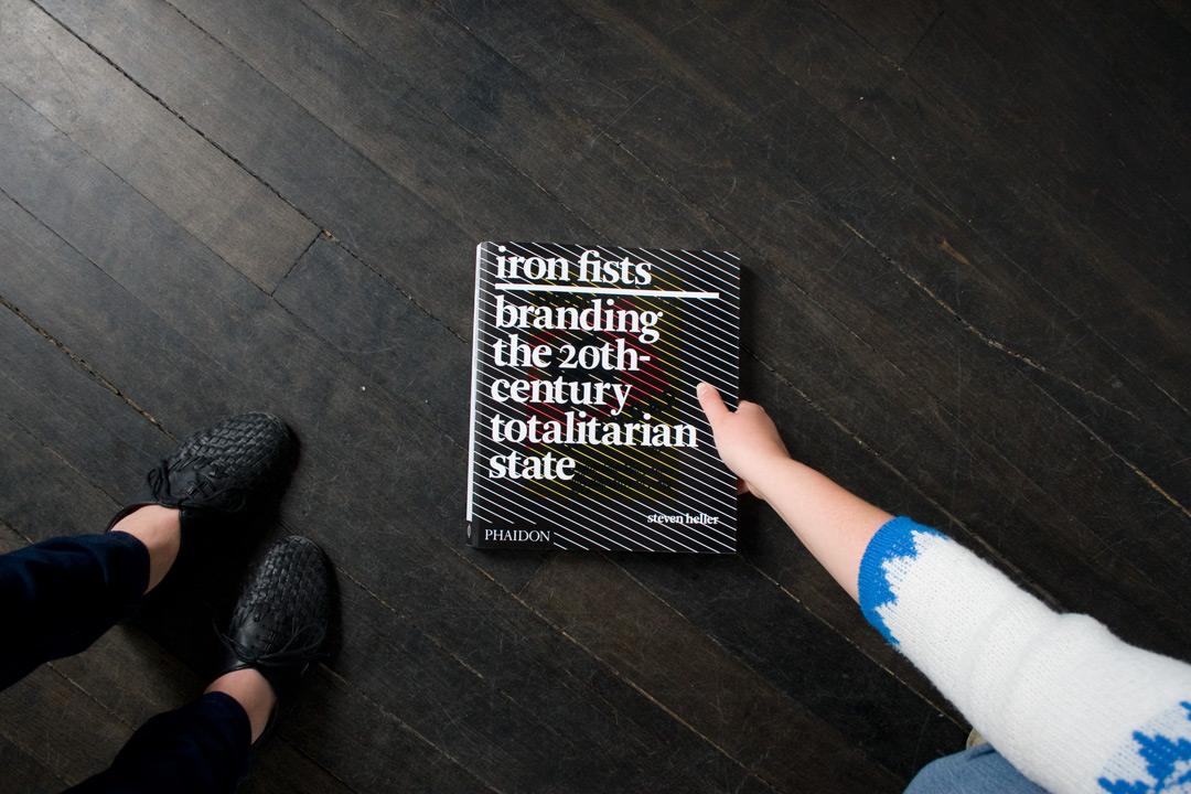
Iron Fist: Branding the 20th Century Totalitarian State by Steven Heller.
In this week’s edition of ArtAsiaPacific‘s Book Blog, we’re covering Steven Heller’s Iron Fist: Branding the 20th Century Totalitarian State. When the paperback edition of this book (the hardback version came out in 2008) arrived in the office, I let my true nerd nature show and didn’t hold in any of my excitement. It combines two of my favorite subjects: design history and the rise of nationalism in the early 20th century.
Also, let me be honest with you, we wouldn’t cover Iron Fists for the Book Blog it weren’t physically beautiful.
In Iron Fists, Heller, one of the most respected design historians and critics, covers the iconography and general design aesthetics of the Nazis, Italian Fascists, Soviet Communists and the Chinese Communist Party—ideologies that also served as models for later authoritarian regimes, such as Francoist Spain and Kim Jong-Il’s North Korea. Heller’s basic thesis is that the most “successful” (albeit tyrannical and oppressive) regimes branded themselves not unlike modern corporations. And like modern corporations, these goverments tried to elicit “brand loyalty.”
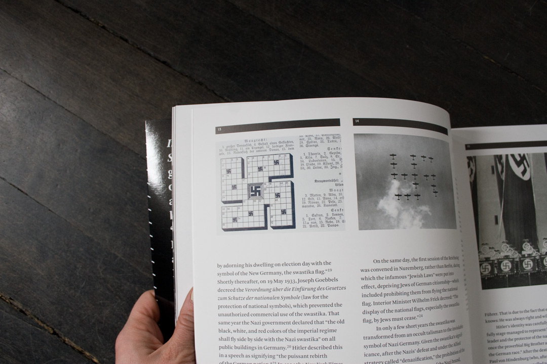
Most successful brands find ways of creeping into every aspect of everyday life, like this swastika cross word puzzle.
This sentiment might seem dramatic or at least less the realm of ArtAsiaPacific and more of Adbusters. Of course, Bounty Paper Towels won’t imprison you for writing an unpopular newspaper article, or publicly humiliate the consumers of Scott Paper Towels. But I am positive that, in the design offices of Landor and Associates or Wieden + Kennedy, there are brand books for Verizon, Subway or Nike that are not too dissimilar to the following “brand book” that was used by the Nazis.
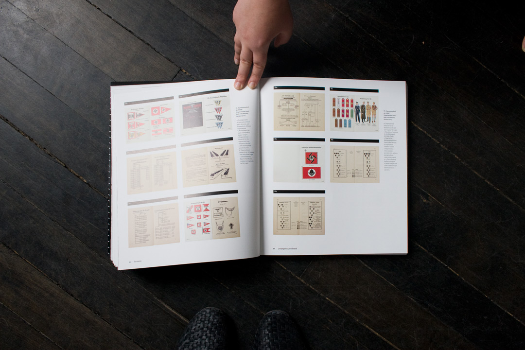
A section detailing the handbook of the National Socialist German Worker’s Party.
Heller points out that, apparently, Mussolini even had jingles and that he, along with Hitler and Mao, was extremely protective of their personal images—much like McDonald’s is over Ronald and countless other corporate brands with their respective mascots. Hitler had it written into law that his image could only be used for government-sanctioned items and purposes. Heller makes the connection between the iconography of Hitler’s moustache, Mao’s eerie smile and Lenin’s goatee to that of the familiar brands and products we encounter in everyday life.
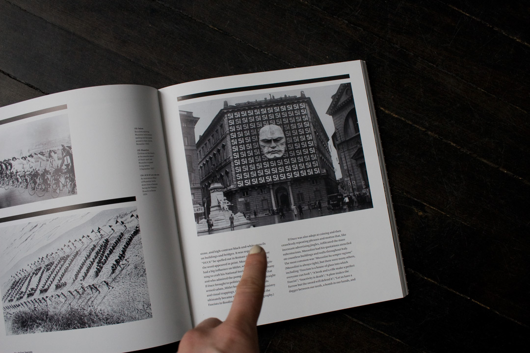
Mussolini’s gigantic, bald head looming over the Palazzo Braschi in Rome, 1934.
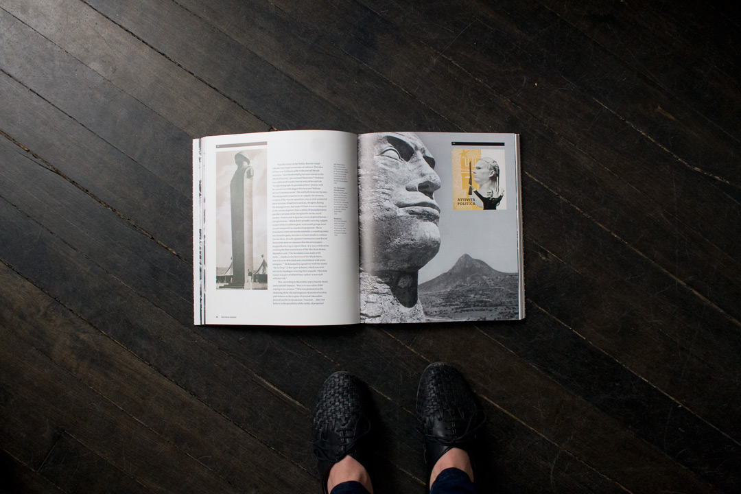
More depictions of Mussolini’s head—this time in a training camp outside Rome in 1934 (left), and an unspecified location in Ethiopia in 1936 (right).
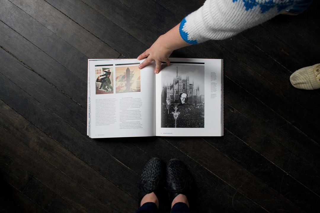
And yet another giant head, this time in front of a cathedral in Milan.
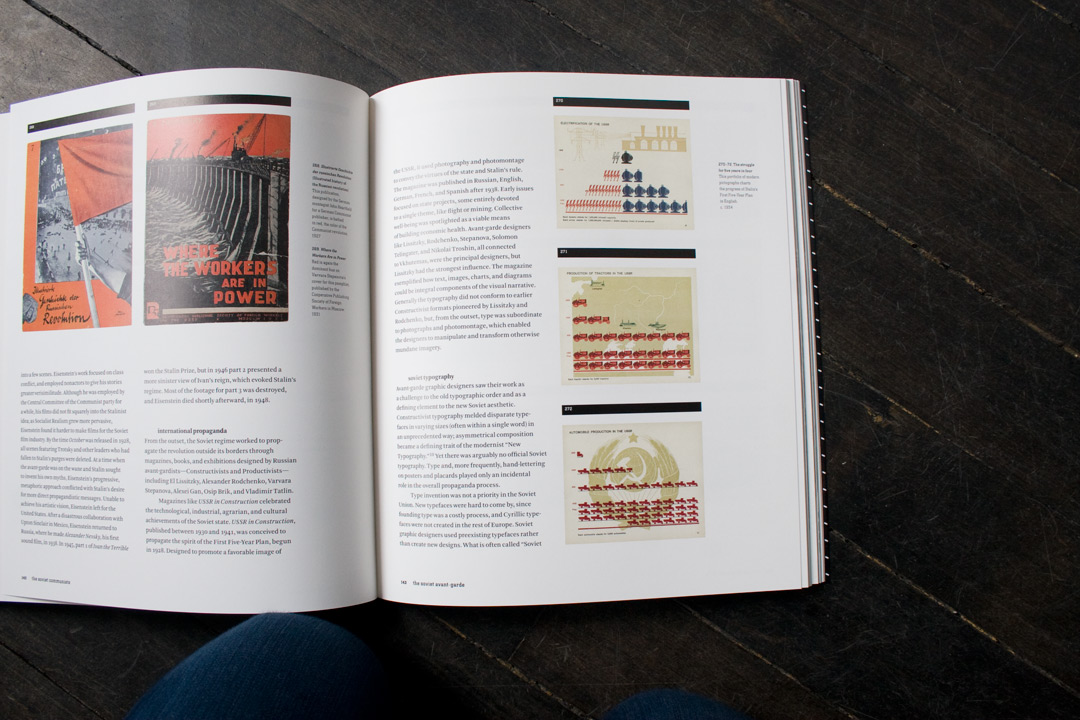
Russian Constructivism, an early 20th-century art movement, was an integral part of the Bolshevik Revolution and is influential in design to this day. Eventually, the government deemed it too subversive and individualistic and replaced with Socialist Realism.
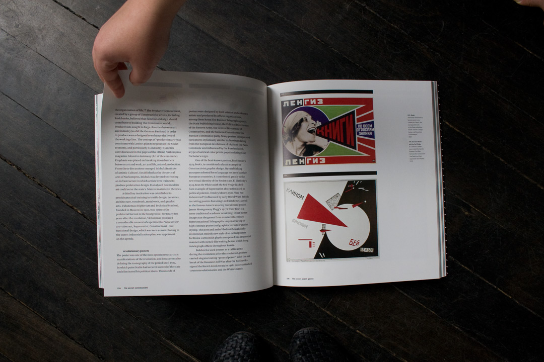
Seminal works by Alexander Rodchenko and El Lissitzky.
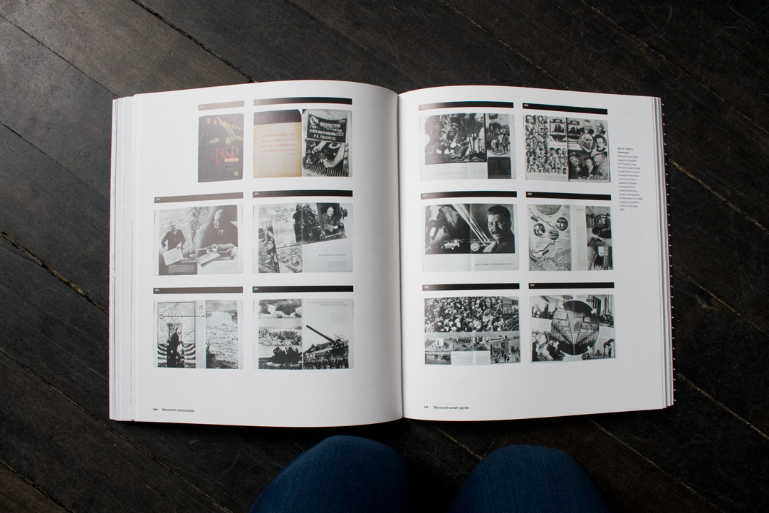
Beautiful spreads from a government commissioned magazine by El Lissitzky.
By the 1960s, Mao needed a re-brand. He had fallen out of favor and was looking for ways to appeal to the youth of China. One of Mao’s most successful projects was his “Little Red Books,” which featured 427 of his best quotes. Mao’s aesthetic steers away from the traditional Chinese style and more towards Socialist Realism. He wanted the images to be universal and not indicative of any particular class.
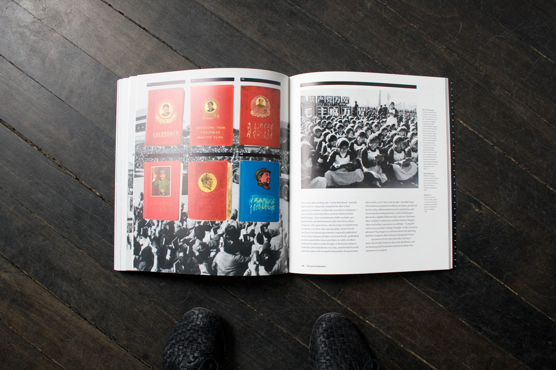
Different editions of Mao’s “Little Red Books” and workers reading from them.
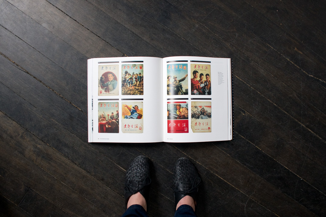
Chinese magazine covers showing off various government-sanctioned achievements. The images were greatly influenced by Soviet Realism.
Check out the design firm responsible for this book, the New York-based Project Projects, as well as Steven Heller’s website.
Book Blog is a weekly showcase of book design from ArtAsiaPacific’s areas of coverage and is written by AAP’s designer, Sahar Baharloo. All images were taken by our photo editor, Alis Atwell.